
Increasing conversion by 3.5% with quick checkout
Swiggy is India’s largest food delivery app with 40M monthly active users. Out of this 3M users visit the cart page everyday.
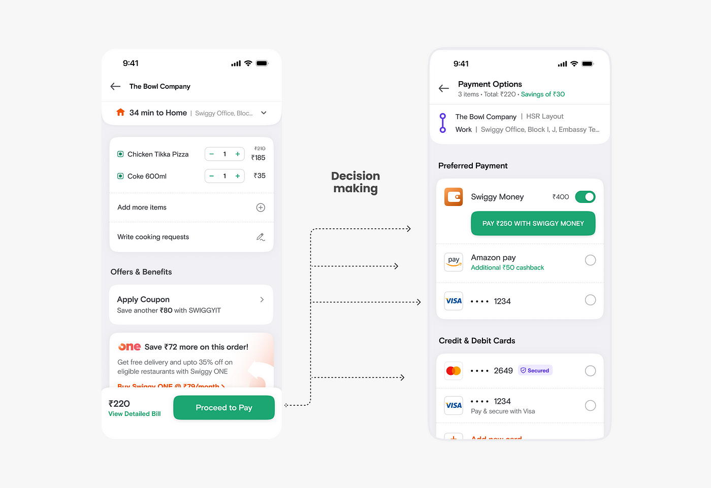
The current payment journey takes the user from the cart page to the payment page. We realised that over time this step was a waste for our users as in 95% of the cases users picked repeated the payment method they paid with. Based on this insight we saw an opportunity to build a better user experience to unlock growth and of course convenience.

Process
We needed to add a way for users to quickly pay on the cart itself skipping the payment page. But while building that experience it was important to look at the JTPD (Jobs to be done) of the cart page itself. The JTPD of the cart page are:
- Review & confirm the items I have added to my cart.
- Check and apply offers if any. Also, get to know how much I am saving.
- Review & understand the prices for each item and the effective total amount after all extra charges and discounts.
Keeping the above in mind we came up with a couple of directions: 2-step checkout with payment CTA on cart and payment CTA on cart
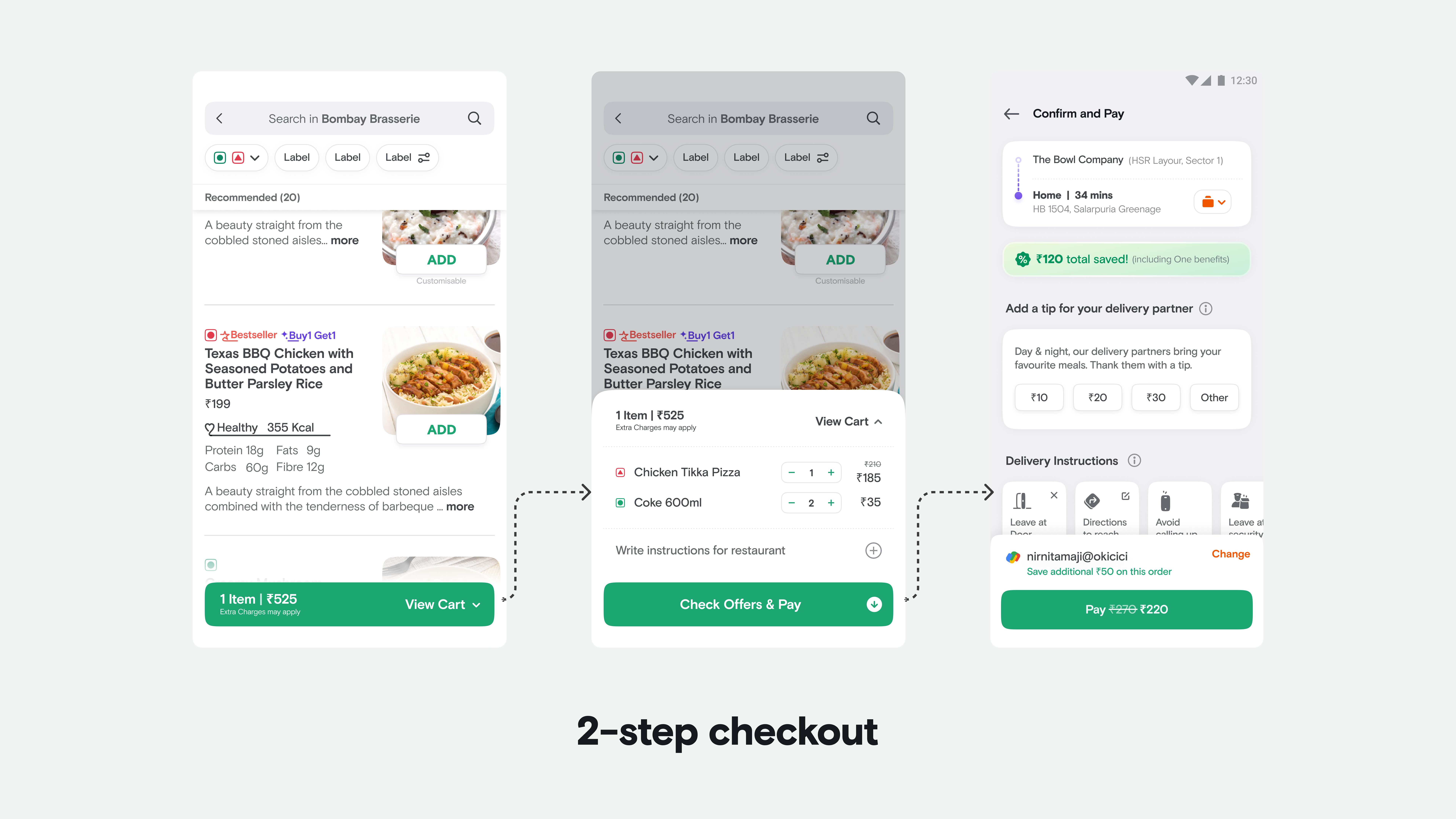
i) 2-step checkout with payment CTA
An early exploration we did was to break the JTPD of the cart page into 2-steps starting from the menu itself. The review part of the cart can be done by the user in the half card and once on cart they can apply offer and pay. We did not refine the approach further as this direction required additional tech effort and was outside the scope of the project. Although, this would be the ideal UX that we plan to execute at some point.
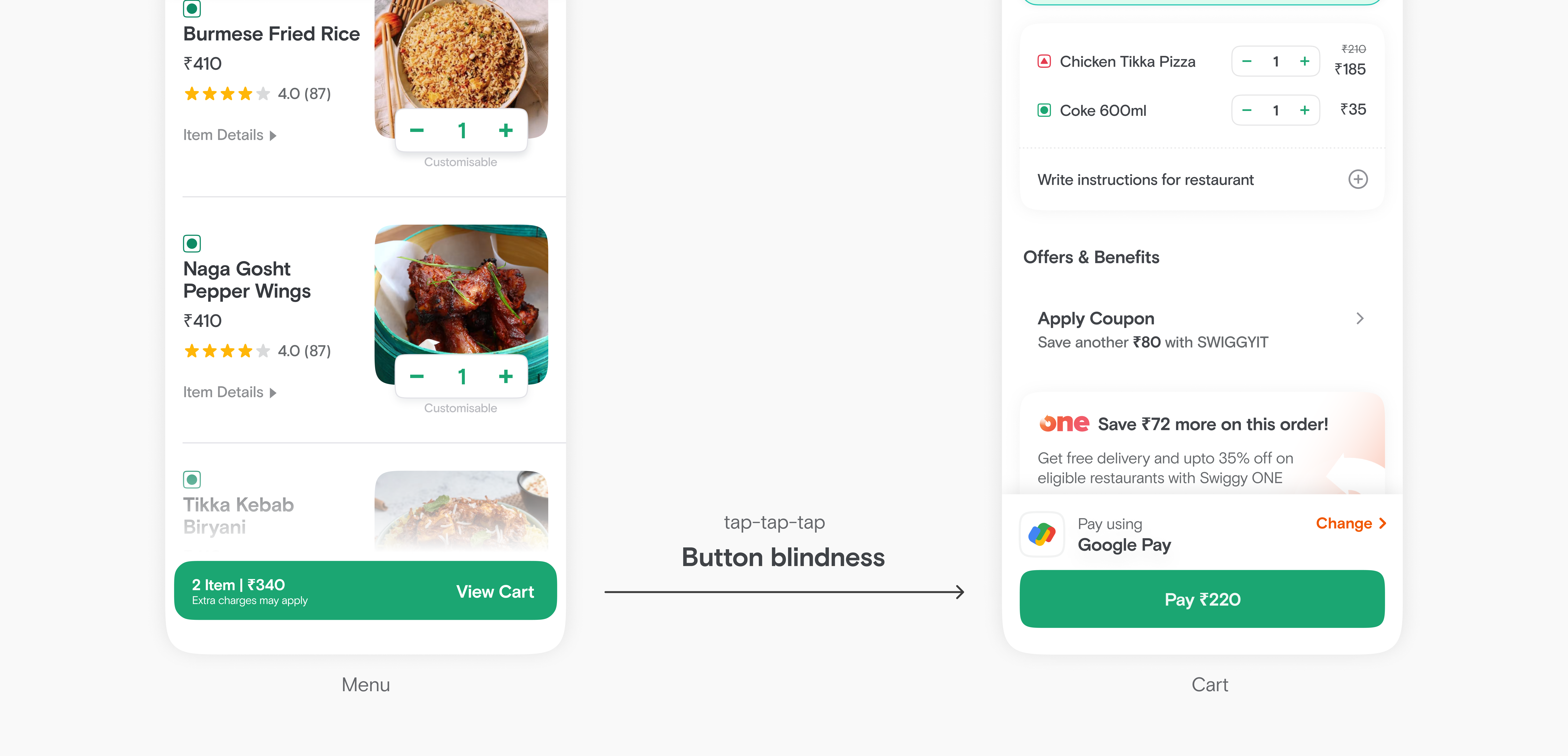
ii) Pay CTA on cart
The second direction was more of straight forward in terms of the flow but we explored here more on the layout. To enable quick checkout on the cart, we needed to showcase relevant payment information, provide an option to change method, display the final amount, and, of course, include a payment button. Considering all these we evaluated below three approaches.
Below are the three approaches that we discussed.
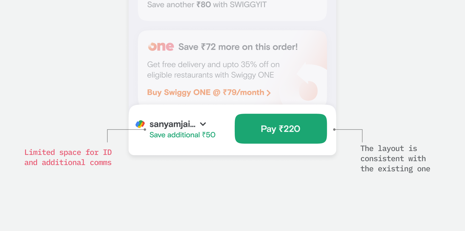
Approach 1
We tried to match the existing layout and embed the new requirements within it.
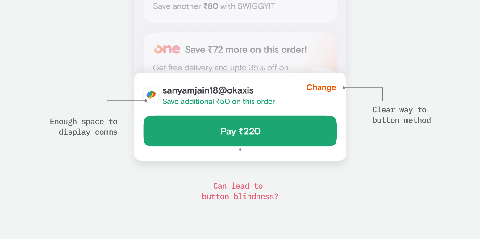
Approach 2
Here, we introduced a full width button along with unlocking more space for the communications by using a but more height. Although, this did solve for the space constraint in the earlier approach, there was another issue. With the full width button there was chances of accidental taps by users specially considering that we had a similar style button on the menu.
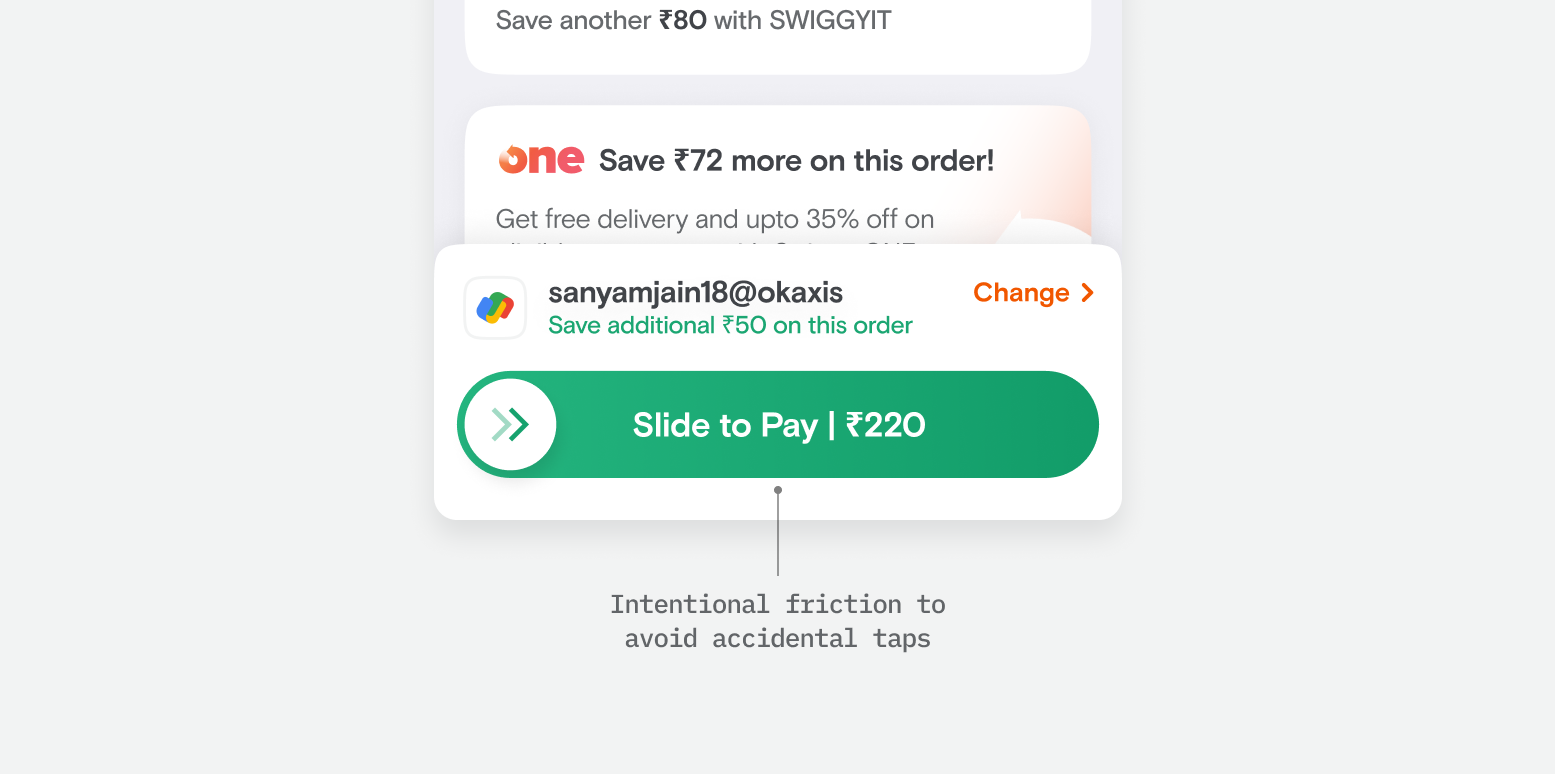
Approach 3
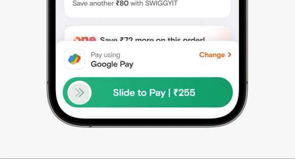
To address the challenges of approach 2, we thought of having a slider interaction instead of a tap button. The slide would be more intentional and add a touch of "healthy" friction.
Even though the design team was more inclined towards the slider we initially went with the tap button. Since product stakeholders had concerns around the complexity and friction slider would introduce and also slider required higher development efforts.
Launching...
Quick checkout being a big shift in the user journey, we released it in controlled experiments and followed a process of analysing experiment data and iterating.
We noticed a couple of trends from the experiments:
Positive trend: We observed a significant increase in conversion, indicating that more users were successfully placing their orders with the new flow. It proved that there was a clear need for quick checkout.
Negative trend: However, some users were dropping off after tapping the pay button, failing to complete payment authentication
Users were not noticing the new pay button and accidentally tapping only to realise later.
While the new UX was a success overall, we didn’t settle for half-baked solutions. We brainstormed to understand the cause of the negative trend. Our first attempt focused on making the tap button more noticeable through tooltips, shimmer animation, and copy changes. But despite our efforts, the negative trend persisted. That’s when we decided to build the slider button (Approach 3), getting all stakeholders on board.
🔗 You can also read my blog on Swiggy design where I go into detail about adding healthy friction to UX with the slide-to-pay and talk about the hinting framework.
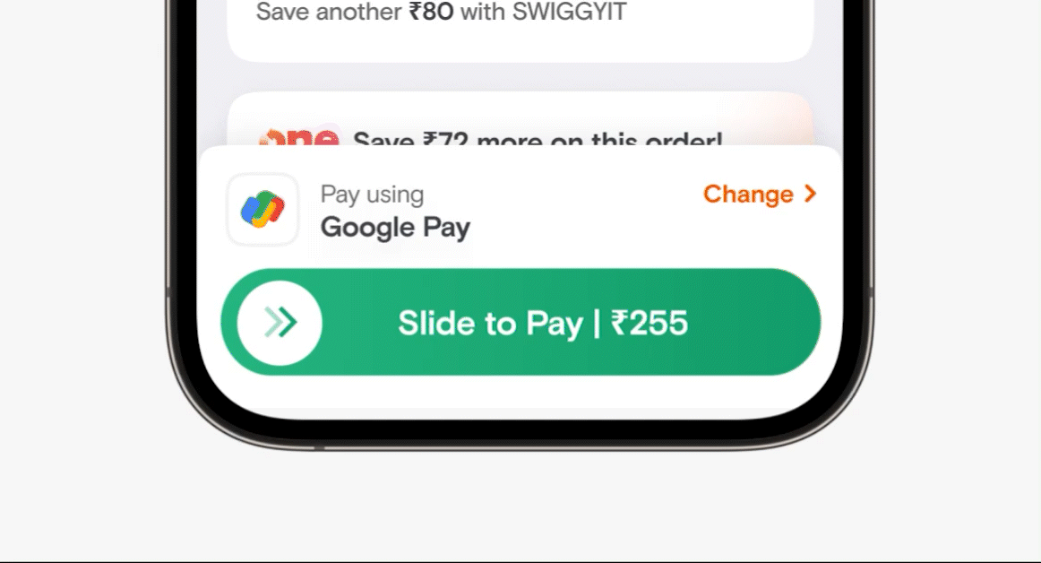
Building the slider
Now that we got stakeholders alignment we made sure to define the slide button meticulously. We thought of every aspect of how our users would be interacting with the slider. One of the major concerns that stakeholders had was that it might lead to a drop in conversion as the fear was that users might not be able to comprehend the slide interaction. To address this, we took various measures:
Educating with hinting
One straightforward way of educating users about a new experience is using tooltips, which we did. A secondary more smarter way is hinting. Hinting is a way to subtly educate the users on how they are supposed to interact. The way we thought about hinting was not from a first time experience but as a part of the core UX.
Hint #1: On each page load, the slider bounced to the right, accompanied by a shimmer effect, indicating the intended action that needs to be taken.
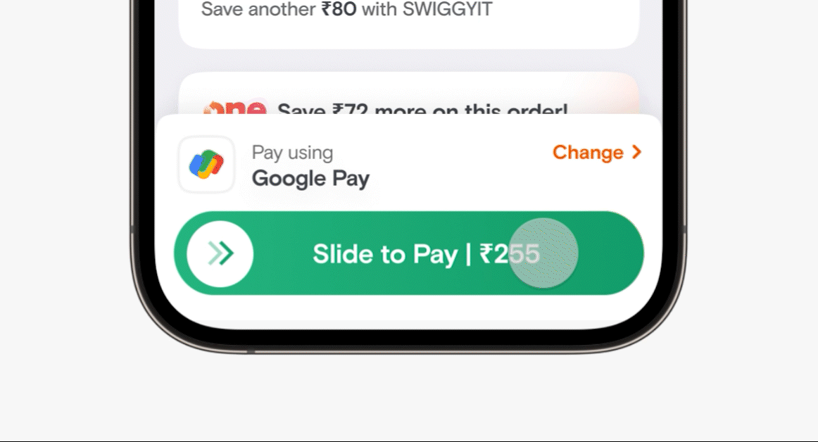
Hint #2: If a user tapped on the slider than meant that they wanted to complete the action and pay. So to capture this intent and guide the users the slider bounces to right indicating the interaction that is needed to complete the action.
Tweaking the completion point
Typically, a slide interaction is considered complete when the slider reaches the end point. At Swiggy, for instance, we implemented a similar slider a few years back and learned that users didn’t slide to 100% and left the slider midway. So learning from the past we instead defined the completion area at 70%.
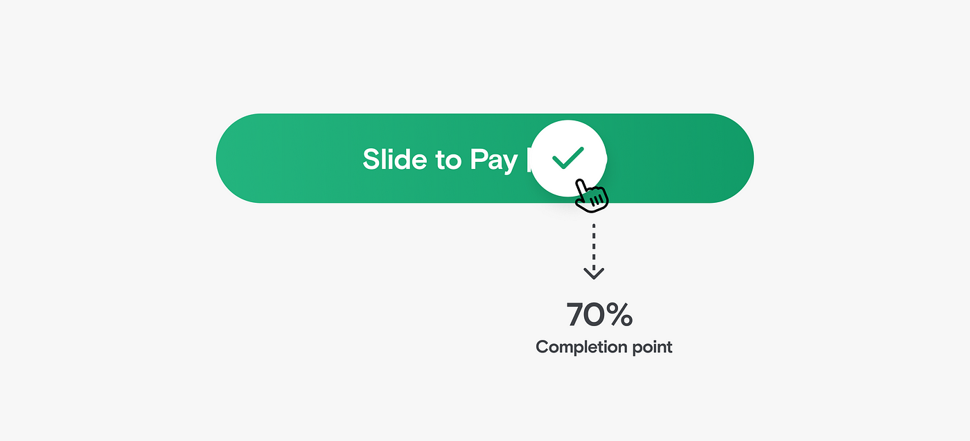
We also added a couple of signifiers to indicate the state change here; the double chevron inside the circle turns into a checkmark and a subtle haptic feedback is triggered
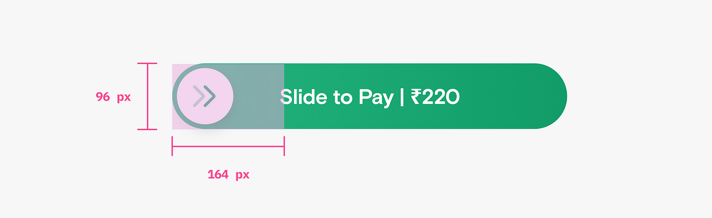
Comfortable touch area
We ensured that the tap area of the slider was larger than its visible footprint, allowing users to interact comfortably.
Accessibility check
People with accessibility mode turned on their device cannot use gestures like slide. So for such users we do not show the quick checkout UX and they can pay through the regular journey via payment page.
--
With these measures in place, we were ready to experiment with the slider button for our quick checkout UX.
And voila! 🎉 Upon analysis of data it was clear the slider button added healthy friction to avoid accidental taps without affecting overall user conversation. Now, quick checkout with a slide-to-pay interaction is live for all our Swiggy users.
Outcome
- Quick checkout on cart helped increase the conversion by 3.5%.
- Unlocked a framework of quick payment of Swiggy which is empowering upcoming initiatives for quick ordering.
- Upon witnessing the success of quick checkout on food journey, Swiggy's grocery business 'Instamart' also adopted quick checkout
- User love!